Besides gold and silver, white was the ZERO artists‘ most favoured colour.
White, above all else, epitomised the group‘s guiding ambition:
The societal utopia of a new dawn.
BY PETRA SCHÄPERS
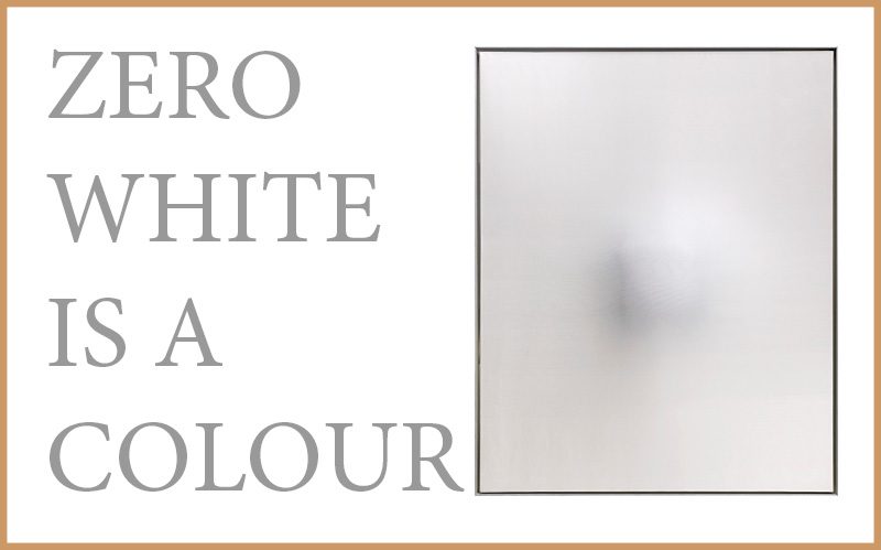
White is a colour. Whether as non-colour or the sum of all colours, whether as the incarnation of pure energy or as a materialisation of existence itself – white is a transformative vessel utilised for the conveyance of utopian spiritual exercises. This has applied for Malewitsch, Fontana, the ZERO group as well as Ulrich Erben. White is a symbol of purity and light, no colour reflects light as well as white. In white, all time-specific and expressive values are absent, white is pure energy and at the same time silent, in white all colours unite.
To Gotthard Graubner, the light intensity level of textured paint itself is of key importance – as opposed to the optical refraction of real light on a physical surface, which took first priority to the ZERO artists. The instrumental use of foam plastic helps create a pictorial form in which the painter’s materials become a central theme of the art work. The opaque art works created by Graubner in and around 1968 all explore the boundaries of this nebulous, experimental composition technique. The spectator is sucked into an impenetrable, opaque aggregate state, underlined by the paintings’ perlon over-sheeting. The context of painting and the traditional two-dimensionality are abandoned in favour of a more sculptural quality – the works are transformed into aesthetic objects, into metaphorical imitations of the spectator’s own spacial perception.


Besides the colour white, the ZERO artists preferred Gold and silver. They applied the colours in combination with textured and uneven surfaces to exploit the reflection of light and create shimmering interplay of light and shade, which are animated by the active movement and shift in perspective of the viewer.
The embossed aluminium plates of Heinz Mack’s double-sided, square relief reflect light in induced refractions, with their shimmering, highly polished surfaces seemingly dissolving.
From 1953 onwards, Herbert Zangs developed something entirely new with his structures made from paper, paperboard and carton. “In my raster-, lattice- and gauze works, I achieved the effects by bending, folding or breaking up the materials to the extent that the properties of each individual material would allow. You can’t, of course, pleat carton or tear up silk paper […] The ‘raster works’ essentially consist of transparent whitenings. Raster alienates […] raster prevent the activation of spirit and thought processes. Raster is like a fence that blocks the path to further development.” (from “Zangs – Plus Minus Leben” 1997, by Thomas Weber).
“It was Luther,” according to German art historian Klaus Honnef, “who, using complex systems of mirrors and lenses, created immaterial, but nonetheless visible, real and at the same time floating pre-images – literally – of real life. These produced dumbfounded amazement and still do, even in today’s era of simulative media, and demonstrated the existence of ‘parallel worlds’ which we cannot directly perceive. It was Luther who, not alone in his spatial settings, turned the supposedly passive observer into an indispensable co-creator. His art works are accessible to those susceptible to broad-mindedness.”
Petra Schäpers is a specialist in modern and contemporary art and representative of Dorotheum in Düsseldorf.